Search This Blog

Pages

Tuesday, May 24, 2022

How to Avoid Having an Ugly Website


Websites are important for every business. In today’s digital age, having accessible online information is crucial for success. Just having a website isn’t enough, though. What matters is what’s on your website.

Website content needs to be geared toward making the consumer want to interact and engage with it. So, let’s take a look at what not to do when creating an appealing website, and I’ll show you what you should do instead along the way.


You’ve read this far for one of three reasons:

  • You want to learn how to optimize your website for the best consumer engagement and interaction
  • You’re worried that your website is ugly and came here for peace of mind that it isn’t
  • You had nothing better to do and the catchy title of this article made you blow a little air out of your nose, which, in today’s digital age, translates to one “lol”

No matter the reason, you’re here for a solution, so let’s dive right in. Before we discuss any more, take a look at this website: http://thebiguglywebsite.com/. Don’t worry, it’s safe for work!

Are your eyes bleeding yet? I wouldn’t blame you.

We know your website can’t possibly look this bad, and we also know that this website is TRYING to look bad. Now, what are the chances you scrolled down to see what was listed on this site? If they gave out a million dollars at the bottom for clicking a link, chances are that you wouldn’t have walked away with a penny.

Why is this? Consumers don’t want to engage with unattractive content. Think of your own website content for a moment. If somebody looked at it and felt the same way you just felt, do you think they would stay and interact with it? Probably not.

Start by thinking of all the things you’ve hated on websites you’ve visited in the past. Chances are, one or more of these was on your list. If they weren’t, they will be now.


1. Ugly domain

Do you find it easier to go back to a website with a simple domain like website.com (an example), or do you prefer to type in randomwebsite123.org/data0=184/net%/ (another example)? You may be saying, “But hey, I just Google the name and click on the link!” Sure that might work for you usually, but would you be happy having to find your favorite and most visited websites by Googling them every single day? You’re better off having a website that people can remember if they choose to. A consumer’s first impression of a website is largely design-related, so don’t you think some of the people in that category want to see a neat and tidy domain? Of course, they do!

2. Long loading times

I considered leaving a bunch of blank space here so you would have to scroll down and waste your time to prove my point, but I decided to make you read this sentence instead.

Consumers hate waiting. This is the digital age of instant information. It takes consumers only a split second to form an opinion about your website. That tiny amount of time shouldn’t be spent on a blank loading screen! Even worse than that, if there is a long loading time every time a consumer tries to interact with your website or navigate the different pages, they are going to get increasingly annoyed.

Here is the worst-case scenario: You have a consumer who is ready to buy from your online shop, they start gathering up products into their cart, then they get fed up with waiting and instead buy from your competitor. Want to avoid the tragedy? Keep it fast!

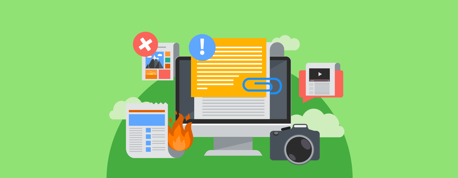
3. Complicated or overwhelming interface

Does your website have too many buttons on it? Are people being bombarded with information? People are being trained to ignore huge amounts of website content due to websites crawling with ads. Keep it simple and focus on important topics or focal points that they can engage with. With plenty of consumers abandoning a site due to poor design, you can’t afford to hide your crucial information in text garbage. Don’t lose consumers because they can’t find where you hid the crucial information on your jumbled page.

4. Automatic music or videos

Many people listen to music while they work or surf in their free time. If you’ve ever noticed a little speaker icon on the right side of your internet tabs, it means that sound is coming from that page. Many people’s first instinct is to kill that tab because it’s forcing disruptive sound onto their experience, and auto-playing audio or visual content can cause valuable consumers to leave your site.

If you have videos on your main page, great! Just make sure you let people click the play button on their own. At the very least, it will give consumers a chance to silence their other music and video sources before they listen.

5. Website doesn’t scale

Do you always look at a website on your computer, or do you sometimes use your phone or tablet? Don’t you hate it when you’re interacting with website content on your phone and you have to scroll all the way to the right to read the full line and then scroll all the way back for the next line? It’s terrible! Make sure your website bends and twists to fit every screen—this is called responsive web design, and it’s very important. If people don’t realize your website actually operates differently on their smaller screen, you’ve done something right.


Your website content is one of your most important marketing tools. Whether or not people engage can mean the difference between one dollar and one million dollars in revenue. It’s worth it to take the time to make your website beautiful.

Business Website Essentials


Telling a small business owner to “assume the perspective of your customer” is one of those classics easier said than done problems. It’s not for lack of trying, but owning a small business isn’t just a job, it’s a lifestyle. And when you put that level of passion and commitment into something, your unique familiarity with it can be tough to shake.

Yet this is the simplest way to quickly optimize your website. By deeply considering your customer’s perspective and buying journey, we can make decisions that put everything in the right place for the customer to easily and quickly complete their interaction with your business and maybe even leave a nice review to boot.

While it’s absolutely essential to have each of these elements be part of your website, the specifics of their presentation need to be in consideration by your specific customer demographics. Most notably will be the difference between the information on an online store, where the priority is to drive sales, versus a traditional brick and mortar business, where the priority is to get them to visit you.


The must-haves

Contact information

Much of your web traffic will be coming from customers looking to use your website as a tool to communicate with you. Whether by email, phone, or in person, the information that helps them accomplish this needs to be a top priority. Placing an easily found “contact us” link in the top right corner of your website is never a bad move. But if your customers aren’t web-savvy, consider putting your address, phone number, and hours of operation right on the home page. Additionally, if your business location is a little off the beaten path, consider using a map application on your website to help people better understand your location.

Product information

This is a growing priority for small businesses online, as a huge number of searches now happen on mobile with the intent of “in the moment” product research, sometimes even in-store. This means that the more specific information you can have online about what you sell, the better. This may even lead to customer conversions while they are in a competitor’s store.

Keeping an up-to-date and functional product catalog online can be a lot of work, but it is most certainly worthy of consideration given the potential value. This is particularly important if your demographic skews younger and more web-savvy.

Business description

Give a quick, easy-to-find snapshot of your business and history available for people interested in learning a little more about you. Keep in mind, if people are looking at this part of your website, they are likely close to buying. Make sure you put in a little marketing effort here to help seal the deal. Make it concise but include things like business history, location, relevant achievements, and philosophy. It’s also not a bad idea to include customer testimonials if you have them.

Quicklinks to social channels

Social platforms like Facebook, Instagram, and Twitter are all great tools to help foster a direct line of communication between your business and its biggest fans. Your website should prioritize getting those follows and likes as easy as possible by installing a quick link widget into the footer or header of your website. That way, no matter where your customer goes on the site they are always one click away from connecting with you on Social.

Content/media

It’s becoming more and more common to see small businesses feature active content strategies and it’s easy to see why:

  1. Content is authentic - No one likes being sold to, and content is a great way for a business to build a relationship while leaving the hard sell on the shelf.
  2. Content is made for local - A good content strategy can help a business establish itself as grounded in its local area through authentic stories that are for and about their community.
  3. Content is hyper-targeted - Based on how you answered the first three questions your website, at least a little, is likely targeting customers at a specific part of the sales funnel. Having a fully realized content strategy allows you to add balance to your site. For example, if your site is designed to drive new sales, perhaps the content can be targeted toward customer retention by adding value to those people already in the fold.

Easy content strategy win = how-to videos

These can be extremely effective and easy to produce. Plus, creating how-to videos gives you the platform to demonstrate your expertise. Double-win if it’s related to your business.


Putting it all together with design

When considering design and layout, it’s completely appropriate to look at it as an opportunity to infuse some of your business’s personality into your website’s look and feel. But heed this warning: design is where it’s most critical to consider the customer’s perspective. Too often small business owners create a website that works perfectly for themselves while failing to consider how it will work for their customers.

Here are two top-level considerations when choosing a design.

Mobile functionality is king

This has to be top of mind at every stage of design. While most modern design templates are mobile functional, it’s worth taking a second look at the ones that do it best. And if you haven’t updated your website since the inception of the smartphone, you might want to think about a redesign.

Keep it simple

You may have noticed that this article really pushes the need for priorities. With that in mind, consider putting only the most crucial information on the home page. Your home page must include easy links to contact info, product info, and business description. After that, it becomes really dependent on your goals and objectives. But when considering the perspective of your customer, oftentimes less is more.

Build for speed

By keeping things simple and prioritizing mobile functionality you are likely also building for speed. But this point is critical enough that it bears repeating. Your site needs to be fast! According to a study from Forrester Consulting, 40% of shoppers will wait no longer than 3 seconds of load time before abandoning a retail website. As well, Google uses load time as a factor in determining your search rank so a slow site might even be keeping customers from finding you when they look online.


Final thoughts

All in all, it’s a pretty swell time to be building a website for your business. Hosting is cost-effective and secure, design templates have never looked nicer, and there is plenty of great content out there to help guide you through the process. But if you are ever curious if your website is serving you well, just follow this tip from Kevin Lao at Google: take out your phone, pull up your site, and ask yourself “do you like what you see?” Now go to your closest competitor’s site and ask yourself the same question. Your answer will tell you all you need to know.

Tuesday, May 3, 2022

What are Listings and Why Do They Matter?


Listings are an online summary of essential information for your business that serves as a powerful tool to help customers find you online and in real life. Here’s what you need to know:

NAP+W

No, we didn’t fall asleep on the keyboard. NAP+W is the acronym that explains all the information that should be included in business listings.

Name
Address
Phone number
+
Website

These four pieces of information are the business listings starter pack. They provide the basic information potential customers need to have in order to research, contact and locate your business.

Want to score some major bonus points? Include information like hours of operation in business listings—it’s what consumers are most interested in!


Will my listings work?

The effectiveness of a business listing depends on the information’s presence and accuracy. Listings are available through a variety of sources, including search engines, online directories, maps, or social sites. When it comes to listings presence, more is definitely better. Availability of as many sources as possible will create multiple avenues for consumers to find your business. But (and this is a big but), presence only pays off if the listings are accurate. Listings are accurate if the information is correct and consistent across all potential sources. Seems easy enough, right?


Why are listings important?

Listings with good presence and accuracy will undoubtedly pay off for your business. Here’s how:

No more hide and seek

Just as the brightly lit bat signal guides everyone’s favorite caped crusader (that’s right Superman, we said it!), accurate and readily available listings will help guide consumers right to your business’s doorsteps.

They even have similar shapes. Coincidence? We think not…

If a business’s listing is incorrect or missing, the majority of consumers will feel less confident about the brand, likely leading them to choose a competitor’s product or service. The availability of accurate listings ensures customers are actually able to find brick and mortar locations while they’re open for business. This means the money in the business owner’s pocket and, just as importantly, it means the business can be reviewed.

“In my humble opinion…”

An ample review pipeline is an essential tool for developing a business’ online reputation and fostering brand loyalty. Reviews allow customers to communicate their experience with a business to potential buyers, but if consumers can’t find a business listed online, their opinion of it won’t be well-informed. Accurate listings create the opportunity for transparency between businesses and consumers in the form of reviews, and the availability of this information will help increase a business’s visibility.

All aboard the search engine

Consistent, accurate listings and the generation of reviews will directly benefit a business’s visibility by boosting its ranking in local search engine results. Search engine optimization is a complex tool, so why not take advantage of it by simply ensuring your business is listed accurately! Increased visibility means more customers, and what business owner doesn’t want that?


Now what?

This listing low-down provides a basic definition and describes the benefits of business listings. Create listings on sites worth lots of points to improve your listings score. We’ve ranked them by importance using a lot of key factors—how many sites reference them, traffic, demographics, and more.